
Theme : Materiality
This was by far my favorite project conducted at the GSA. I learned touchdesigner in a week and spent the following creating some kind of organism that reacts to the audio input somewhat organically, detecting rhythm, pitch, voice, etc.
Ideation
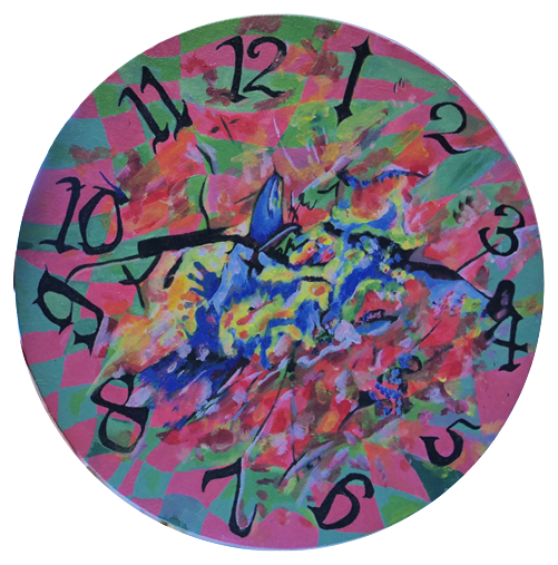
I went for a walk yesterday with my roommate and noticed the park lights change. She needs glasses, and told me she can only see blurry circles of colour. I thought about how it feels to look at bright lights, when the shape then prints in your eyesight, and appears even when you close your eyes. Those could be interesting materials to work with, light, and the circle as a main shape.
I have a few ideas regarding how I’d approach the brief. I love material exploration and as an intermedia student, I don’t have a primary medium, except for film, so this project feels like a good chance to experiment with something new. When I enrolled in intermedia, I remember wanting to try making rave installations, which is something I thought I’d give a go for this project. Our most recent project using machine learning Sense and Sensibility, was very code-heavy which isn’t usually where my interests lie, even though I appreciate the craft and challenge. For this project, I think TouchDesigner could be a strong option. Its visual, node-based environment feels far less overwhelming and much more intuitive for how I like to work.
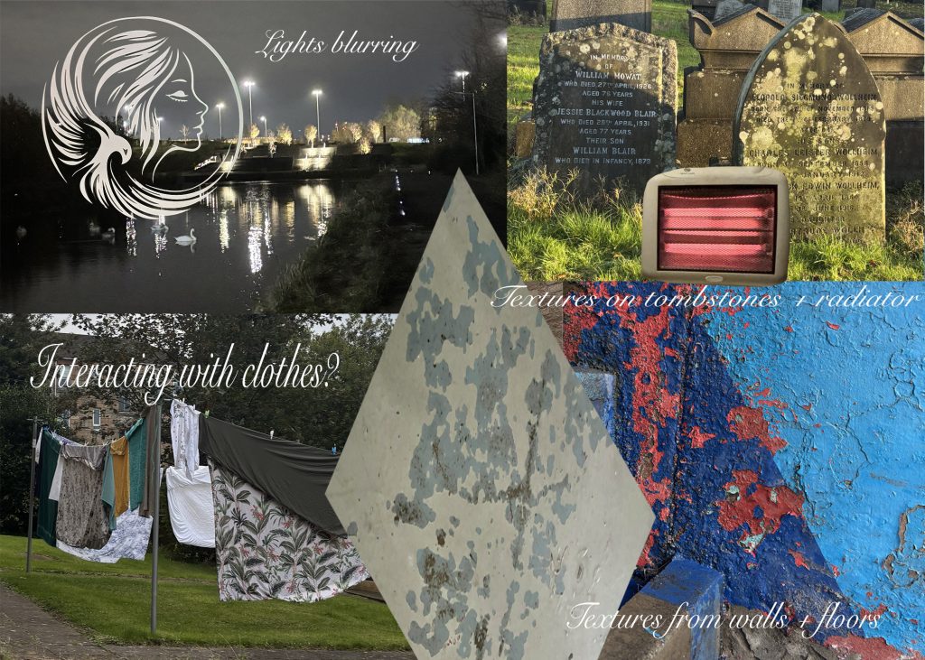
I thought about other materials I enjoy using, or that I pay attention to. I’ve always had an interest in magazines, posters, with colours washed by the sun, especially those decaying fronts of stores, as well as broken walls, chipping paint and holes in fences, things of the sort. I like to see nature take over the industrial, in terms of greenery appearing, or by human interaction. I’ve always been drawn to camp and DIY aesthetics and notice I feel better in environments where you can feel that there’s been a human touch or presence. I think this also ties to my concerns for sustainability, and my interests in the art of repairing, or of using the discarded. It’s something I enjoy doing, I feel it shows care, it’s useful, and is a way of creating outside of capitalism.
Day 3
Visual Inspiration
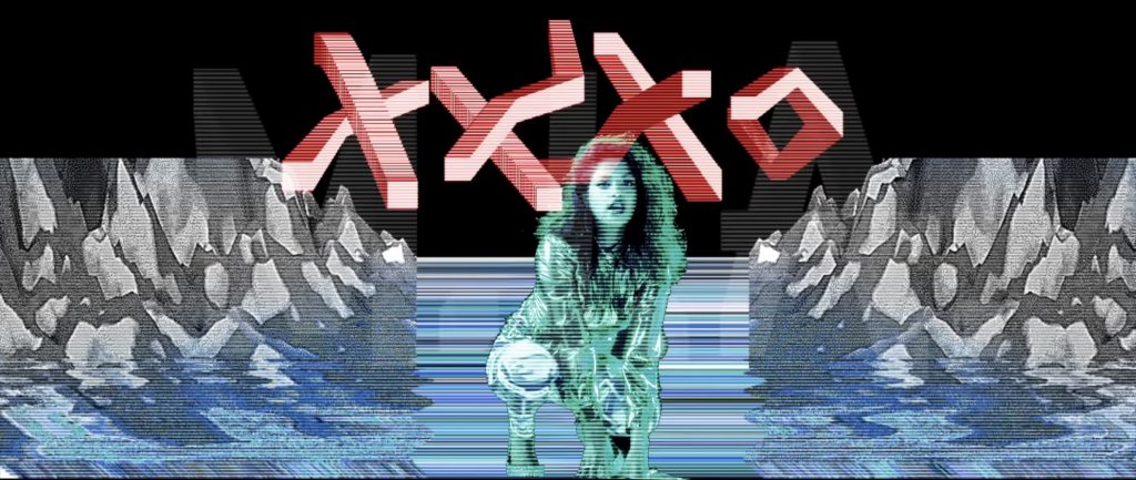
I felt inspired by some visual imagery such as the XXXO video by MIA. I love the Y2K effects, very gif-like and glamour-esque. I was thinking maybe doing a visual effect that alludes to water, ice, and smoke, like the materiality of water. It could be done with hand poses, one for each of the material conditions of water. The ice could be broken and the smoke could clear once one moves their hand in a fast motion. And the water reflection effect could offer an optical illusion, like drowning from the sides. I don’t know what this could mean metaphorically, and think this is an idea that could be developed another time perhaps.
Material Inspiration
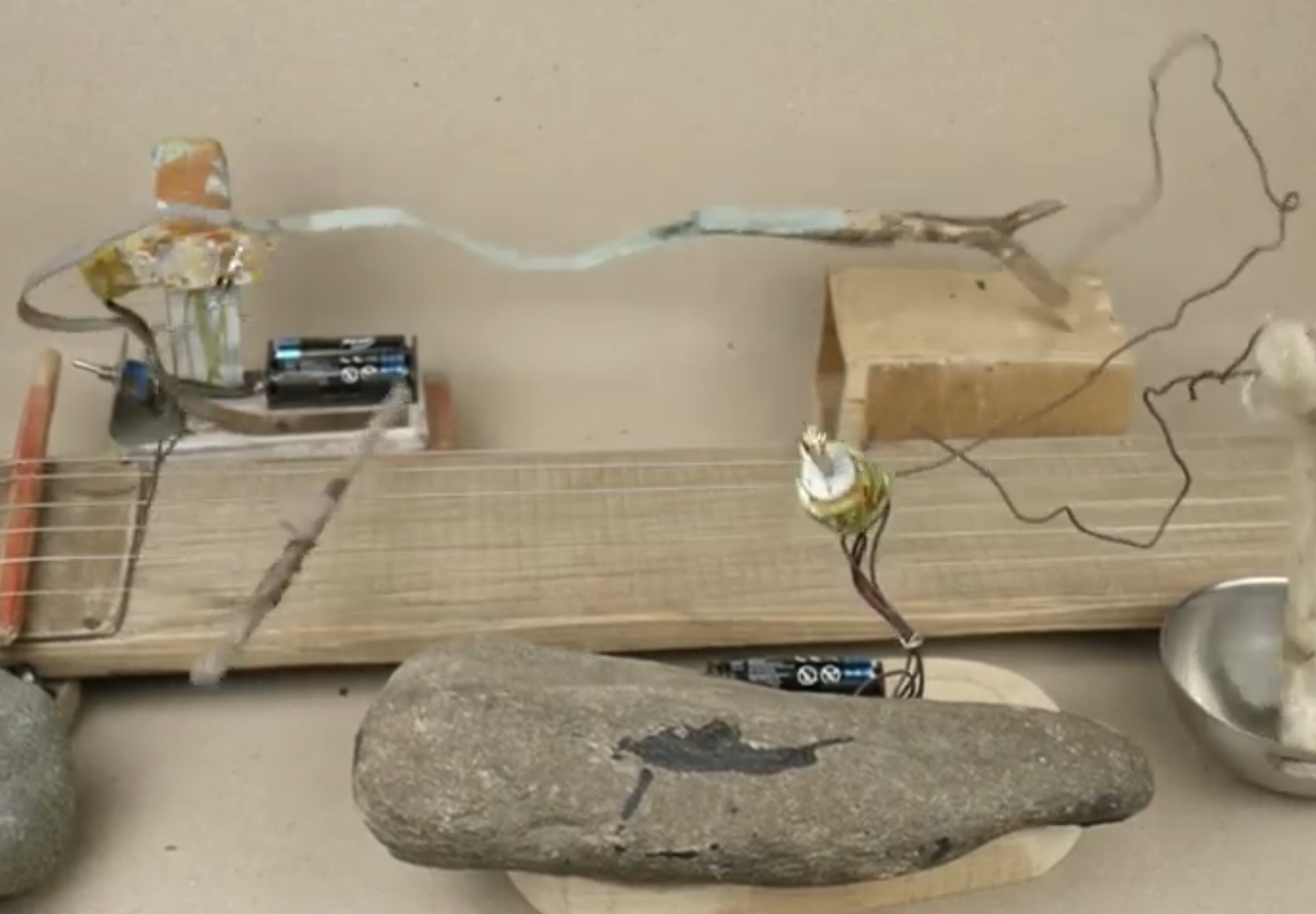
I also thought about artist @the.vape.noise on instagram, that creates musical instruments using robotics. He uses recycled and discarded materials to do this. I’d like to do something like this in the future, I think It’d be a great living creature to keep in one’s space and I don’t oppose to this automated way of music making. I find this kind of art to be revolutionary, as the noise “band” is fully automated, and the sounds we hear relate to the material qualities of the objects he chose to assemble into “instruments”. I’d like to, in the future, make a reactive small scale robotics installation, with eyes that follow the tracked person, as well as an audio track and a mouth that moves when the person does certain movements, but I won’t have time to develop this for this project.
Learning TouchDesigner from scratch
I followed different tutorials on Youtube, to learn the basics of the software such as the main categories of operators and how they can be used. I did a few exercises and explored SOP’s, TOP’s and CHOP’s properties. Once I felt comfortable enough creating a sketch autonomously, I decided to concentrate on how to make the visuals audio-reactive. At first, I connected the visuals to real-time audio input, but it would just react to the sound of my voice. It didn’t create the feeling I wanted, so I turned to live music instead. I downloaded Serato, since I had brought my DJ controller to Glasgow, and installed an internal audio cable to route the controller’s output into TouchDesigner.
I wanted to create visuals I enjoyed, in line with the aesthetics I had chosen in my moodboard: magnifying the beauty of nature, using color combinations, geometric patterns, drawing on “optimistic” aesthetics from the early 2000s, or Y2k futurism, acidwave, psychedelica, superflatpop, vectorbloom, sewing patterns and especially frutiger metro. As described on Aesthetics Wiki, Frutiger Metro uses glossy vector graphics, crisp outlines, and vibrant solid colours, with almost no hand-drawn elements. This aesthetic feels nostalgic to me and reflects the tone I want the visuals to embody. This particular aesthetic conveys strong nostalgia in me, as it was really present through my childhood, but also represents the mood and tone I want my visuals to have. Reflecting on past works, I wanted to create something more culturally optimistic, as I often tend to lean towards social critique.
Weekend
Over the weekend I read a graphic novel on postmodernism as I wanted to keep reading on the intersection of art, culture and philosophy. I was particularly interested in ideas around the simulacra and the simulacrum and the effects of space-time compression that I incorporated in my last project, sense and sensibility. The book mentioned postmodern science, which emerged as a philosophical movement, critiquing the assumptions of modern science and “objective knowledge”.
I feel like optical art powerfully represents this phenomenon, using perceptual interference and repetition to create dynamic visual responses. I wanted to draw from these ideas to build visuals that echo fractal geometry and calming, repetitive, mandala-like patterns, referencing the constant atomic shifts in nature and its inexplicable beauty.
Experimenting with the MIDI MPK mini
I rented the MIDI MPK mini from the depot, and copied the operators from an exercise I did in a new sketch. I changed their parameters using the board. This made me understand the basics of how to make these machines communicate with each other. I decided to go with my Serato DJ controller as I’m more familiar and wanted sound to be part of the installation.
Creating the Audio-reactive visuals
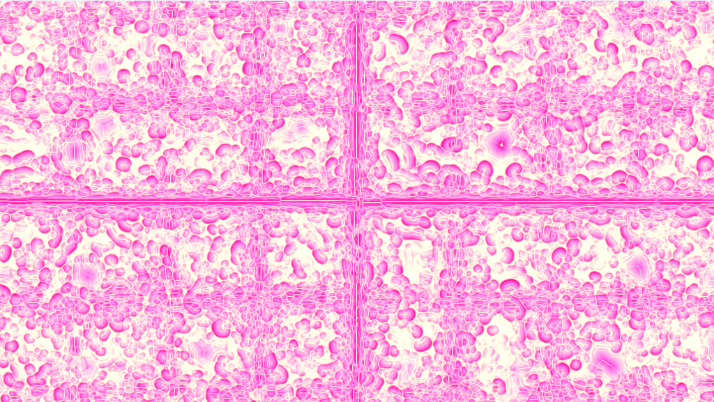
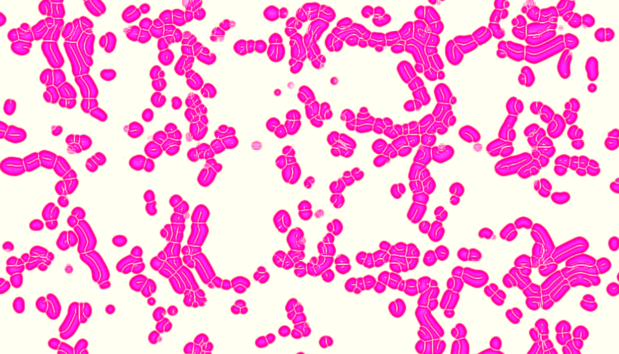
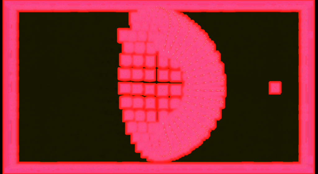
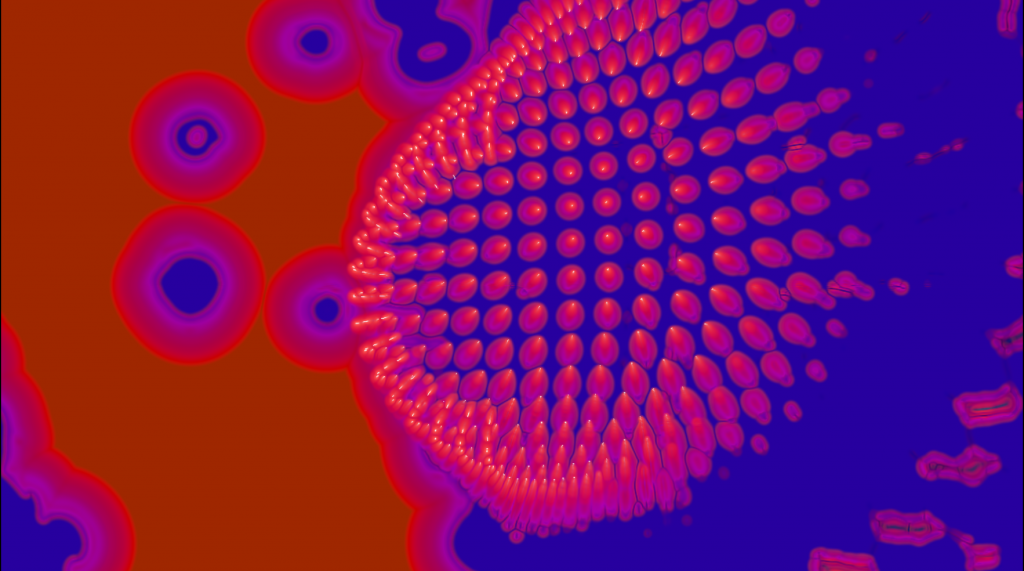
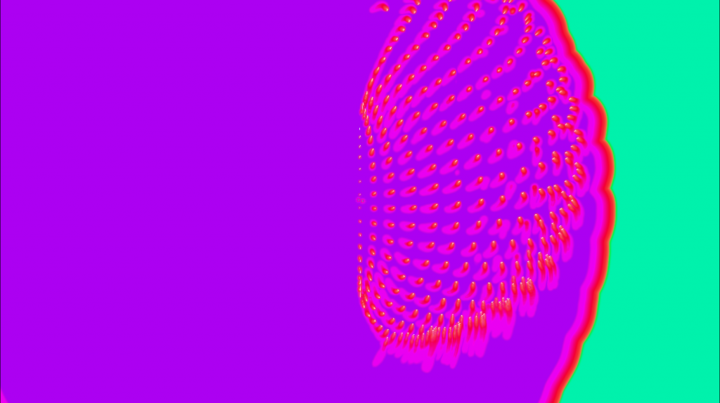
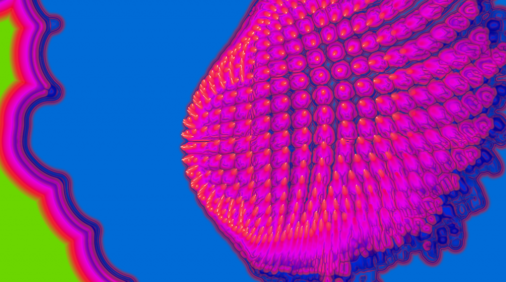
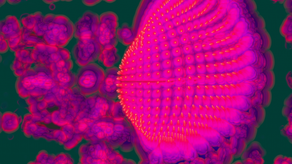
I practiced using different parameters to achieve a fractal effect, some kind of repetitive pattern. I decided to use a particle system on a sphere because I found it was an “organic” shape. I looked at my moodboard and paid attention to the patterns and colours I was seeing and how that made me feel. I then used the audioanalyse parameter to isolate sounds, mostly the highs, lows, mids, rhythm, bass and snare. I split my sketch into 2 parts, an audio base as well as a visual one to reduce lagging and have a clean workspace. I played around, applying the detected sounds to a few visual parameters, in particles (playing with the wind and direction of the circles) as well as in the feedback parameter (modifying the saturation, colors, hue). Playing around with my sketch made me feel like I was creating, or, curating an environment for the particle sphere. I copied the sketch and created different versions, to create new associations and visual behaviours. It behaved unpredictably, sometimes the volume I put was too strong, so it would just turn to white. I kept DJing, went back to see the sketch and noticed it was doing new things based on the feedback of the particles, morphing into a pattern that seemed to mimic cellular structures.
Results
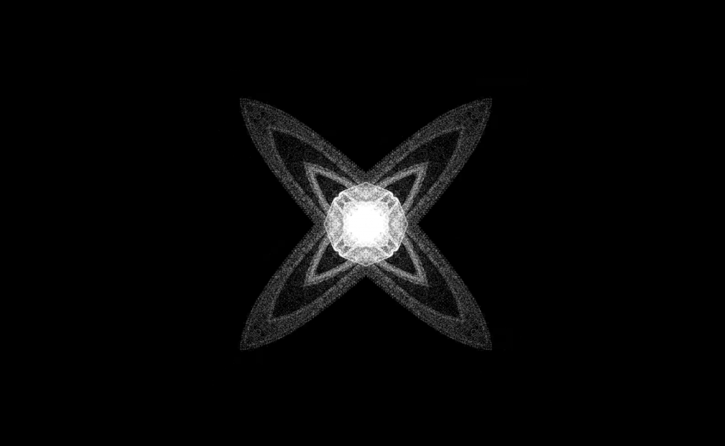
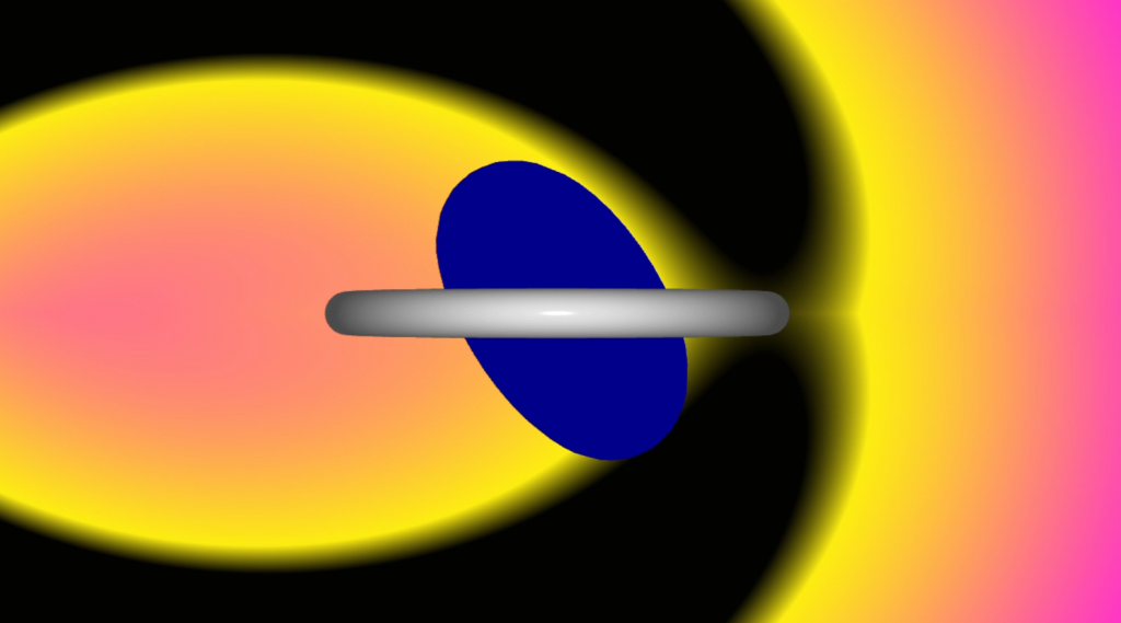
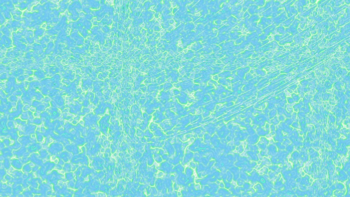
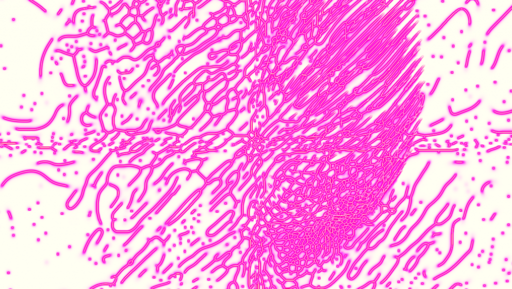
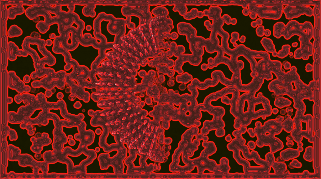
STILLS FROM WIND (GREEN)
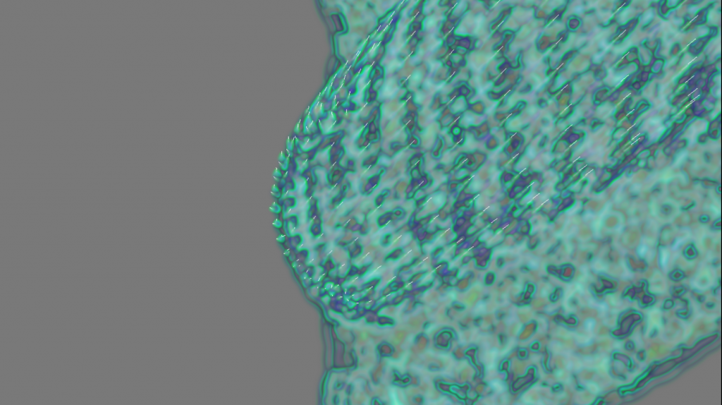


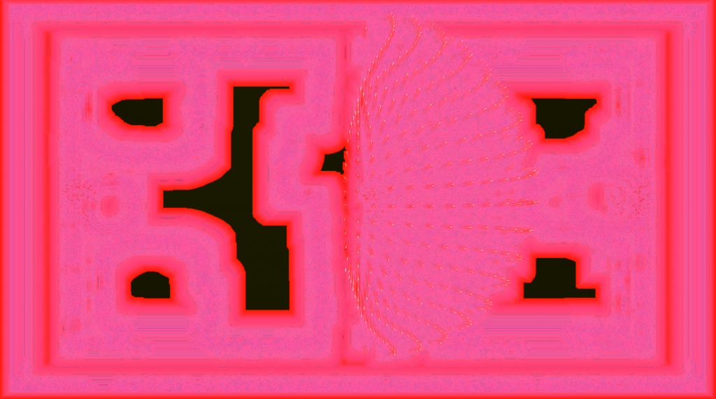
STILLS FROM CELLULAR (PINK)
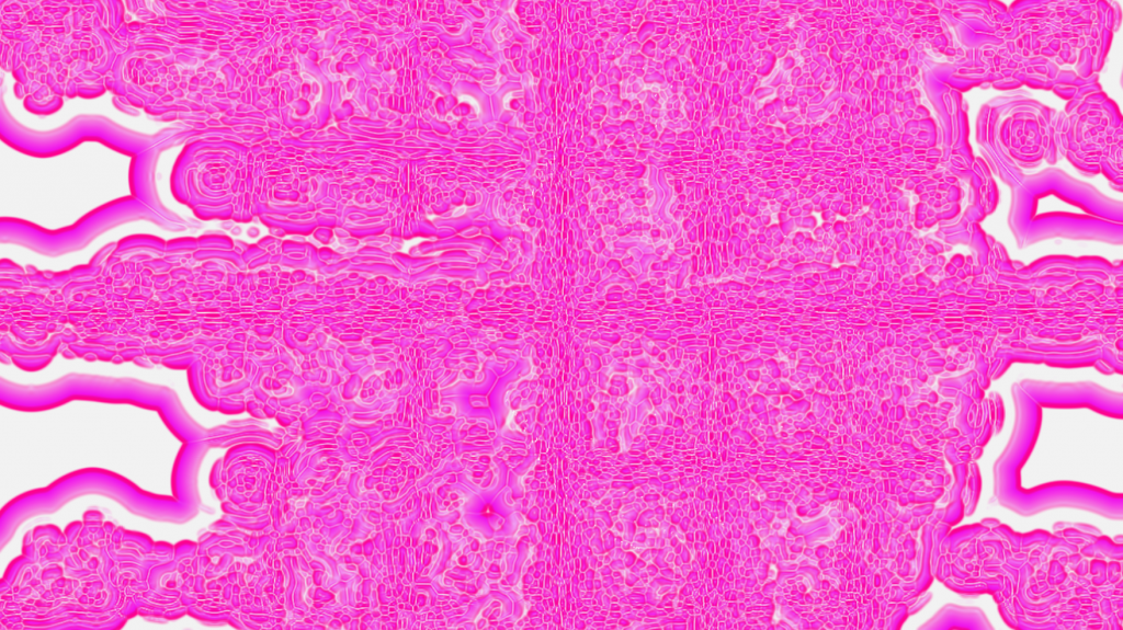
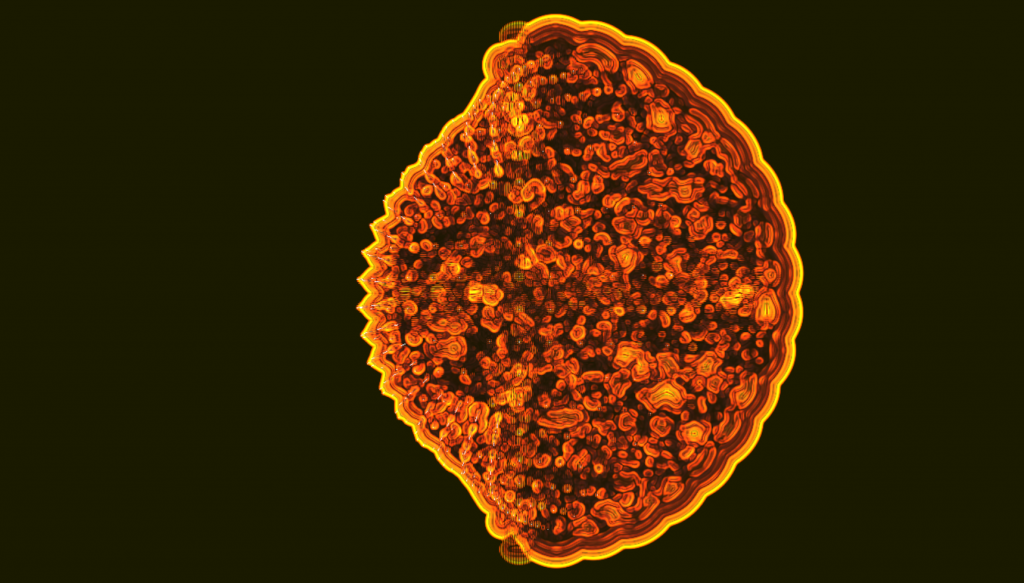
I noticed the system looked like fireworks, and decided to apply a background color change on the bass to express a feeling of explosion, reinforcing the imagery or symbolism the shape conveys. I also noticed, when I let it do its thing, it would sometimes create new colours and shapes I hadn’t seen it do in the span of a few minutes. I liked how it would react differently to different songs, creating new textures. I decided to go with a selection of IDM sounds, a genre known for its mathematical complexity, algorithmic rhythms and intricate structural design, as this echoes well the material processes and changes the sphere will be subjected to, the visual and sonic dimensions relying on principles of pattern, variation, and controlled complexity. I also thought it would be fitting for the classroom presentation setting, as I want to represent rave culture in an appropriate way, considering the fact I’ll be presenting in the morning.
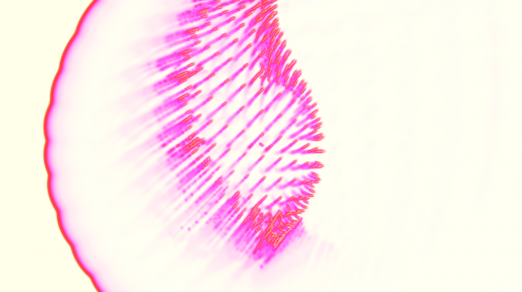
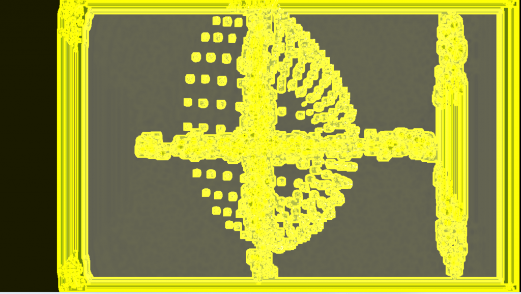
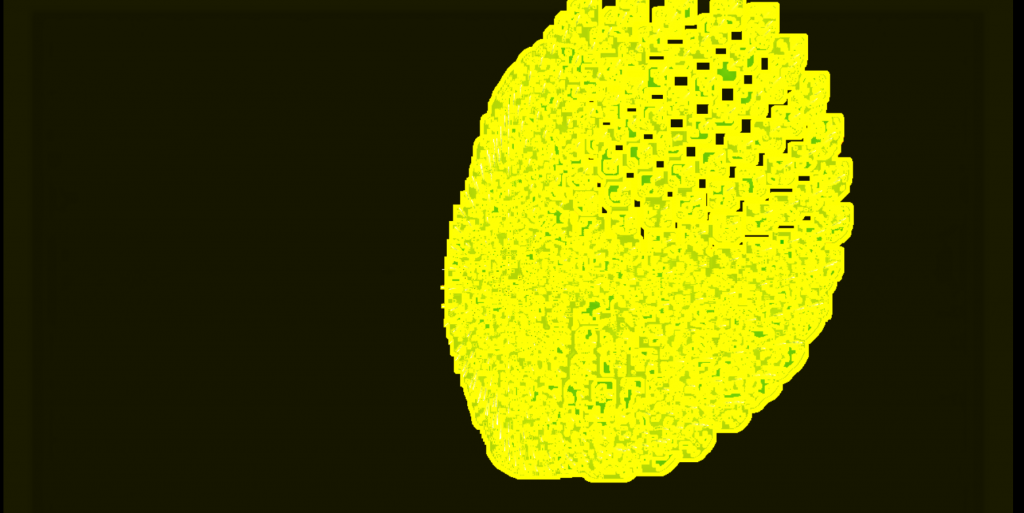
STILLS FROM SUN (YELLOW)
I also wanted this project to address the social and embodied dimensions of dance and communal gathering. Dance functions as a form of collective synchronization shaped by rhythm, space, and shared experience. This ties directly to the installation’s aim: to create a visual environment that responds to and amplifies the communal energy of movement and sound. I added a few ambient tracks to the playlist to evoke a calm, slightly melancholic tone, with deep reverb to give the atmosphere a sense of depth.
OTHER STILLS FROM SUN (YELLOW)

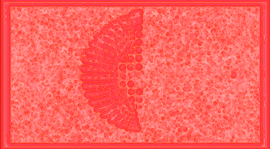
STILLS FROM FIREWORKS (PURPLE)
Creating the pamphlet
I spent most of the day recording the visuals activated by sonic energy. I wanted to create a pamphlet that expressed the visual influences that aren’t put forth too much by the final aspect of the installation. I felt like the pattern research I did as well as my personal readings really informed the work and I also wanted to share how nostalgia plays into this. I printed images from the moodboard as well as some iterations of the model and collaged them to create a “scrapbook” effect. I liked having a few images you could lift and look under, mirroring how there’s always something to discover and notice in how the particles react to sound, and the different interpretations the work can hold. Below is a drive link, including a video of me turning the pages of the pamphlet, as well as screen recordings, the .toe files and photographs of the different “material explorations” I created in TouchDesigner.
https://drive.google.com/drive/folders/1VxpeTCu8MRyH9V022FGhuqvLI9dm5pea?usp=drive_link
Presentation
After the presentation, I decided to try the installation with speakers, to enhance its effect. Continuing this project, I’d like to isolate the sound components more clearly and fine-tune which parameters are impacted. I feel like the ones I linked reflect the way the music can “make one feel” and just a few more variables, such as pitch, bpm, vocal detection, can make the visuals more varied yet cohesive to the sound. I also want to include more cellular-like patterns, as I find them really pleasing to look at. This project gave me the opportunity to finally learn touch designers as well as DJ again after a hiatus. Using this software was actually a really fun learning journey, and exploring the different material properties went smoother than expected. I realized that I really enjoy visual node-based programming, it even started feeling intuitive and I often found myself in a flow state while iterating on the sketches. Not knowing exactly how the visuals would behave and experimenting as I went along was exciting and opened up new creative possibilities for me. I’d like to, in the future, use a video I took while I went on a run, and alter its components with sound. This medium resonates strongly with me: I’m a visual artist, but music deeply shapes the way I create.

Sources
YouTube. https://www.youtube.com/watch?v=qbupHTeJCeU&list=PLx5SITvoCWI8JDApEX0jBXjqzGUyw1SNu&index=9. Accessed 7 Dec. 2025.
Appignanesi, Richard. Introducing Postmodernism. With Internet Archive, Cambridge : Icon, 2003. Internet Archive, http://archive.org/details/introducingpostm0000appi_y4a4.
Client Challenge. https://aesthetics.fandom.com/wiki/Frutiger_Metro. Accessed 4 Dec. 2025.